Article Courtesy: Architectural Digest
Sherwin-Williams Says This Is the Home Color Palette of 2024 (and Beyond)
When it comes to articulating the design zeitgeist, there’s nothing today’s paint brands—Sherwin-Williams included—love more than a good color story. Each year trend forecasters take stock of the pigments percolating on runways, at trade shows, and online, organizing colors into palettes that attempt to distill and define a specific movement within the world of interiors or popular culture at large.
But with how adept today’s trend forecasters are at distilling disparate inputs into an aesthetic narrative, there’s been an increasing tendency for different brands to publish annual color stories that can start to feel like different chapters of the same book, Sue Wadden, the director of color marketing at Sherwin-Williams, tells AD PRO. “The storytelling was kind of blending. Everyone was talking about a nature palette, or a brights palette. I was interested in cutting through the noise.”
That interest led Wadden and Sherwin-Williams to shift gears with the introduction of Anthology: Volume One. The 48 hues found in the brand’s Colormix Forecast for 2024 aren’t grouped into abstract, mood-based categories but four immediately intelligible chromatic families: blues and greens, reds and purples, deeps and darks, and delicate tints.
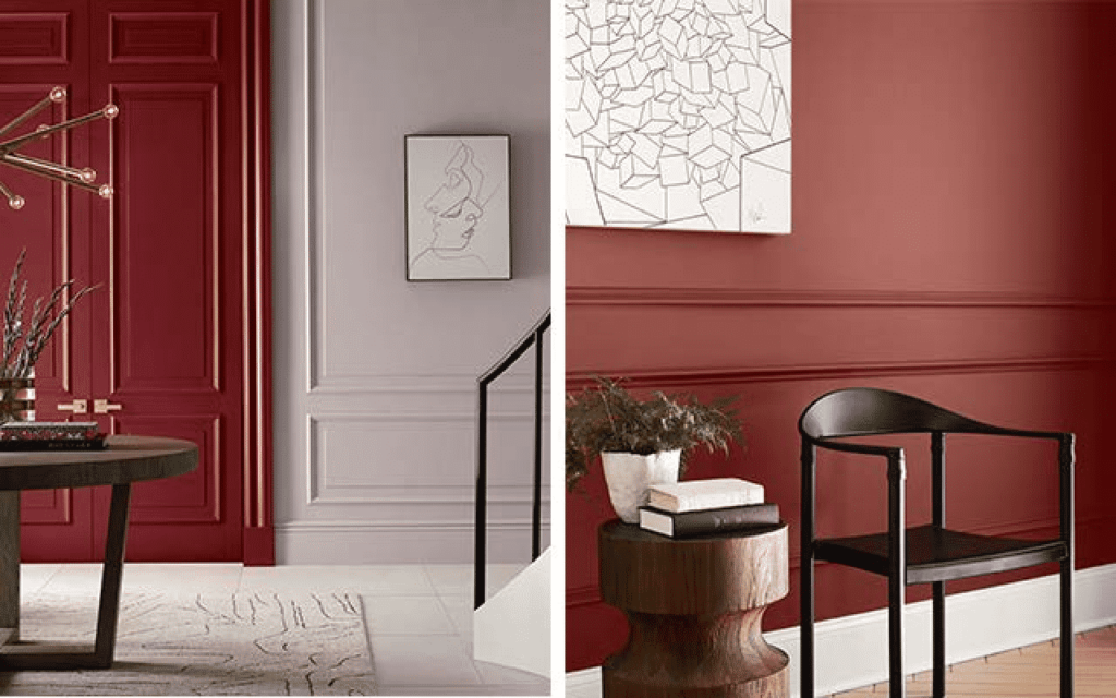
Left: Wild Currant SW 7583 (275-C3), Gloss (doors); Intuitive SW 6017 (230-C3), Flat (walls)
Right: Fireweed, SW 6328 (114-C7), Snowbound, SW 7004 (256-C2)
For Sherwin-Williams, this remixed approach isn’t just about reorganizing how it presents the colors that will define the year ahead. By analyzing trending colors from 2020 to today, the brand seeks to celebrate the defining shades of the decade thus far, while looking for the inflection points and surprising new trends we might look back on in 2030.
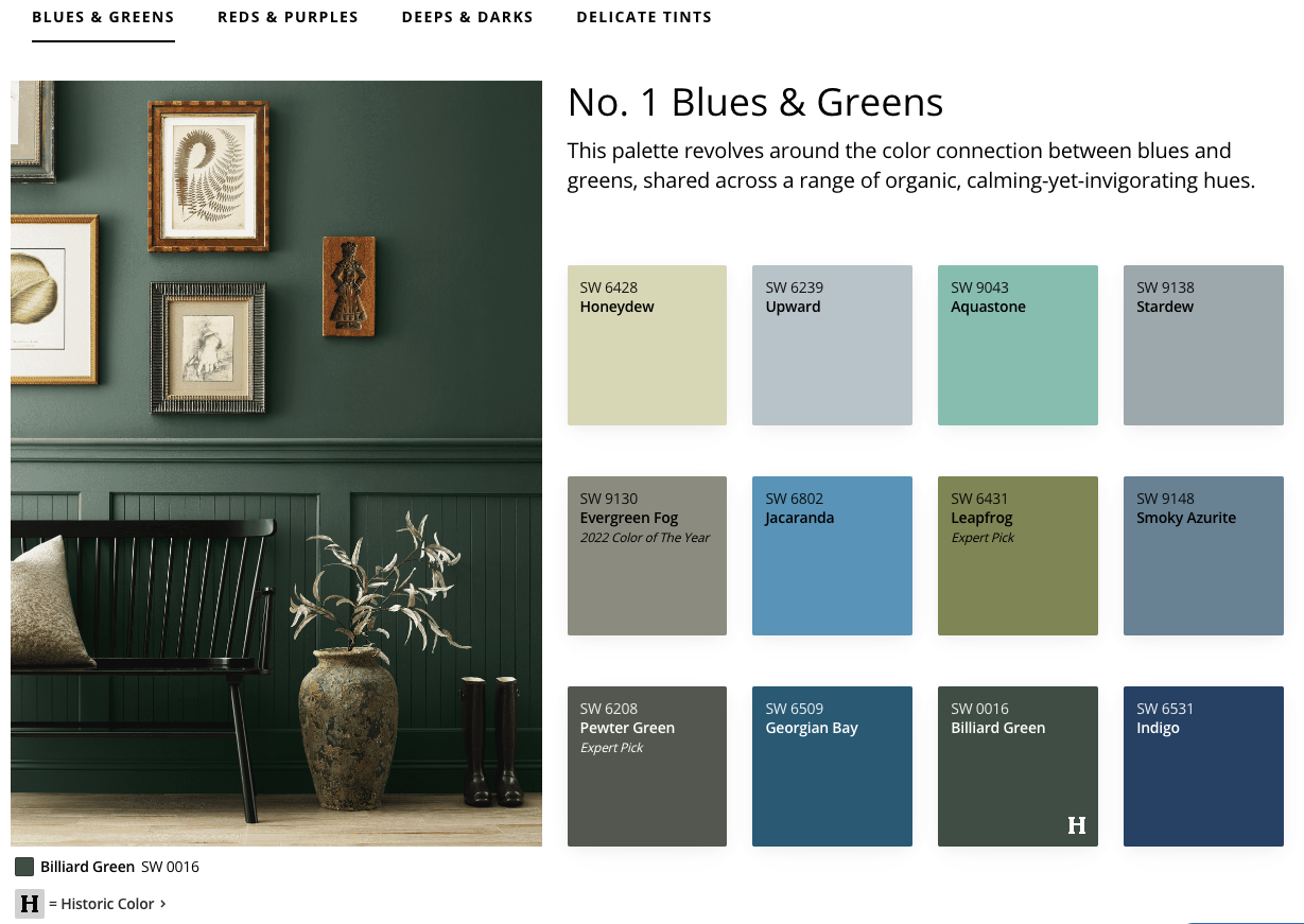
The incorporation of both present and future is evidenced right away in the composition of the blues and greens collection. “We’ve talked about how important green has been for the first part of this decade, [but] blue is going to sort of take over for green in the second half,” Wadden says of this versatile palette that runs from statement-making Aquastone to the quasi-neutrality of Stardew. “From layered textures to tiles to painting your kitchen cabinets or the vanity in your bathroom, the chromaticity of blues and greens fit the bill.”
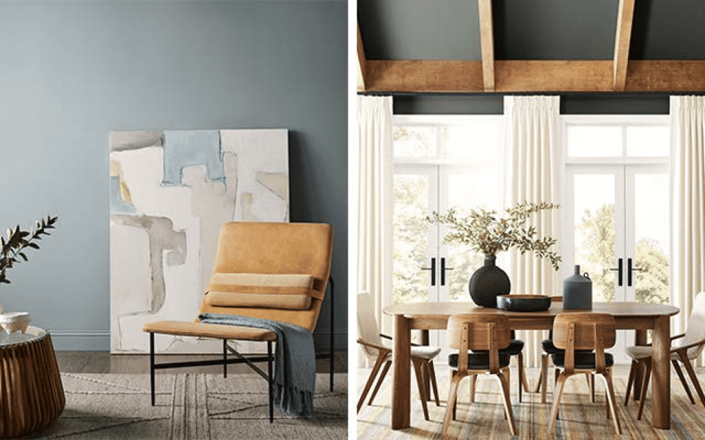
Left: Stardew, SW 9138 (221-C3)
Right: Pewter Green SW 6208 (217-C6), Flat
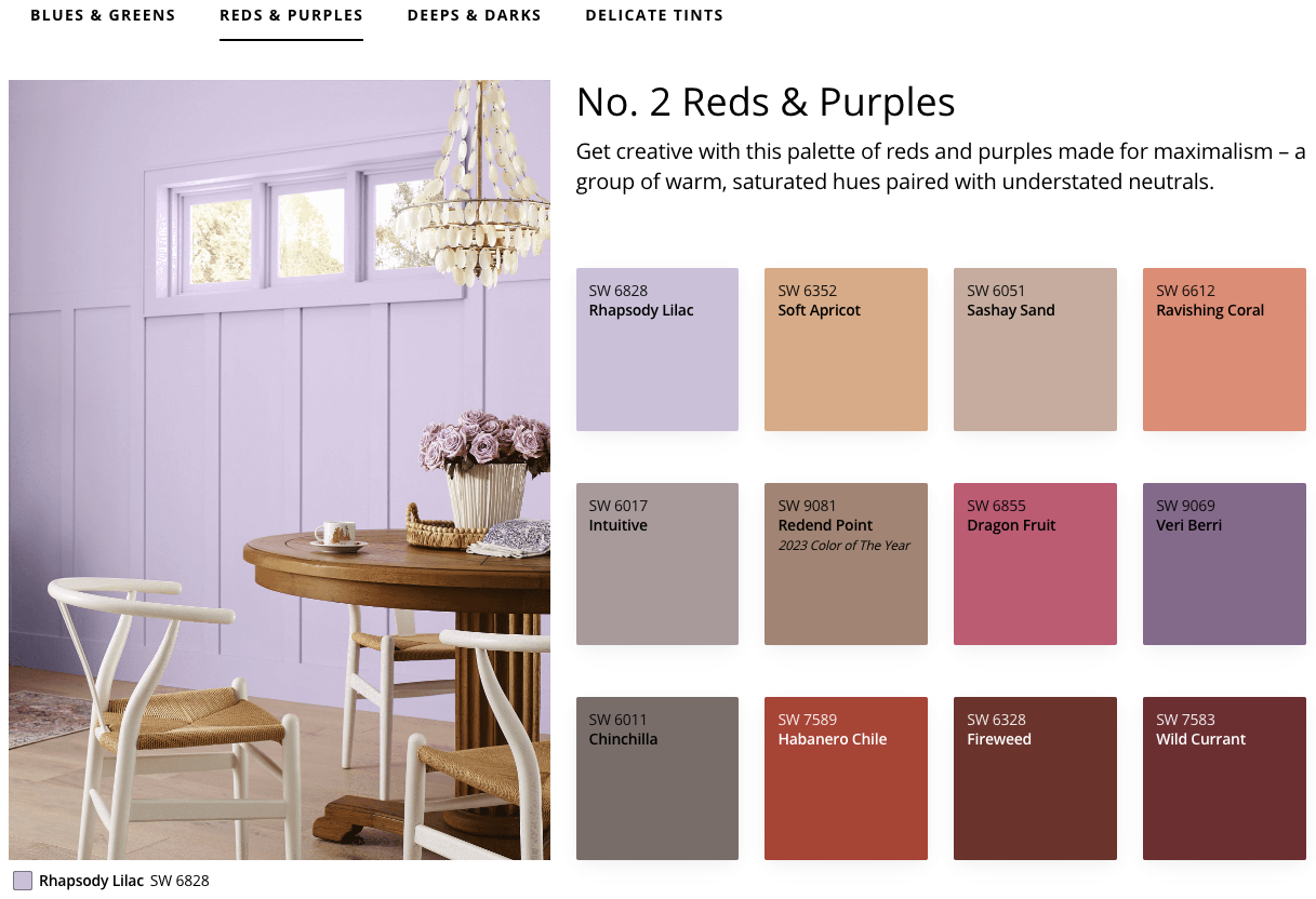
The palette of reds and purples is a statement built around colors like “energetic” reds and bright pinks that pay homage to the Barbie-movie moment. These fun, feisty shades “look great in kitchens, on cabinets and furniture, and in areas that you need more of an energetic space.” Though Fireweed is as strong as its name implies, other options like Rhapsody Lilac also prove that it’s possible for colors in this family to stand out and soothe simultaneously.
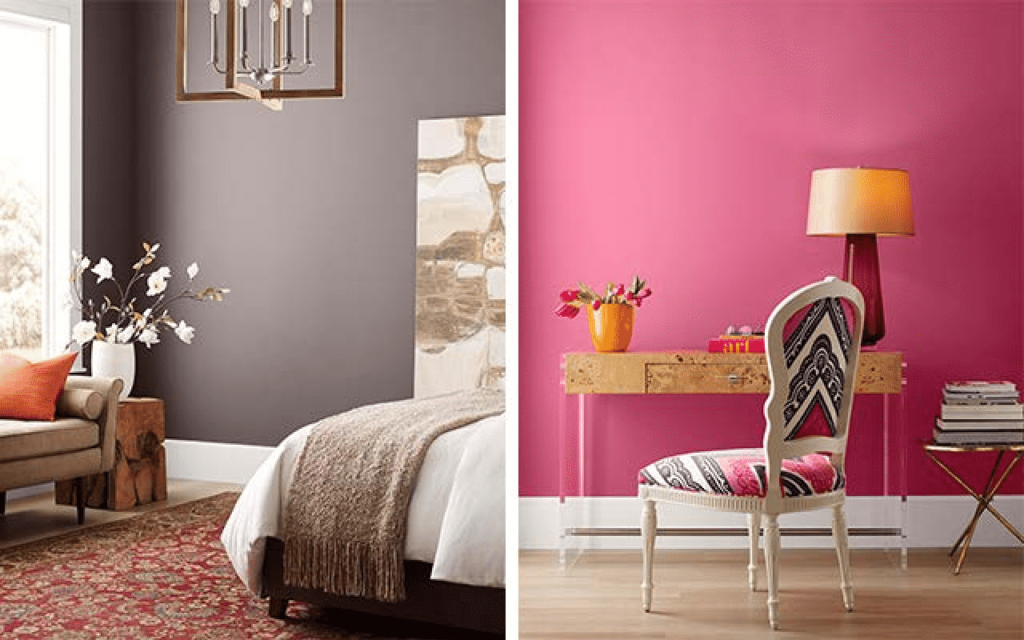
Left: Chinchilla SW 6011 (231-C5), Flat
Right: Dragon Fruit SW 6855 (101-C2), Flat
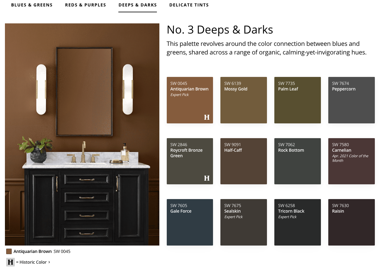
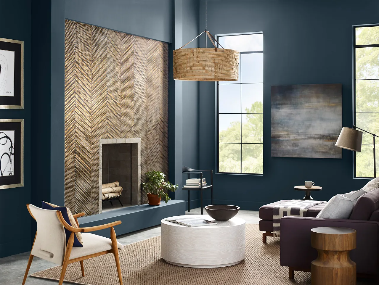
If there’s one palette that’s most prominently linked to the aura of the present, it’s deeps and darks. “In times of turmoil, you need a sanctuary,” Wadden observes. To create a comforting space in a bedroom or living room, bathe yourself in the alluring blue of Gale Force, or opt for Seal Skin’s fusion of black and gray into something more stately.
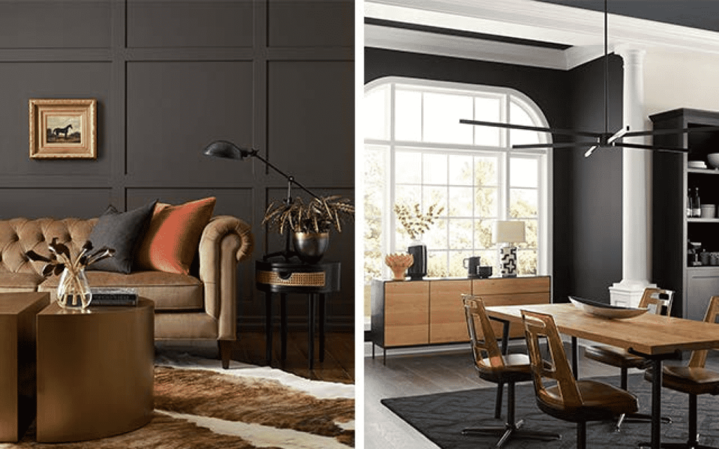
Left: Sealskin SW 7675 (277-C7), Flat
Right: Tricorn Black SW 6258 (251-C1), Flat (walls); Snowbound SW 7004 (256-C2), Satin (trim, column)
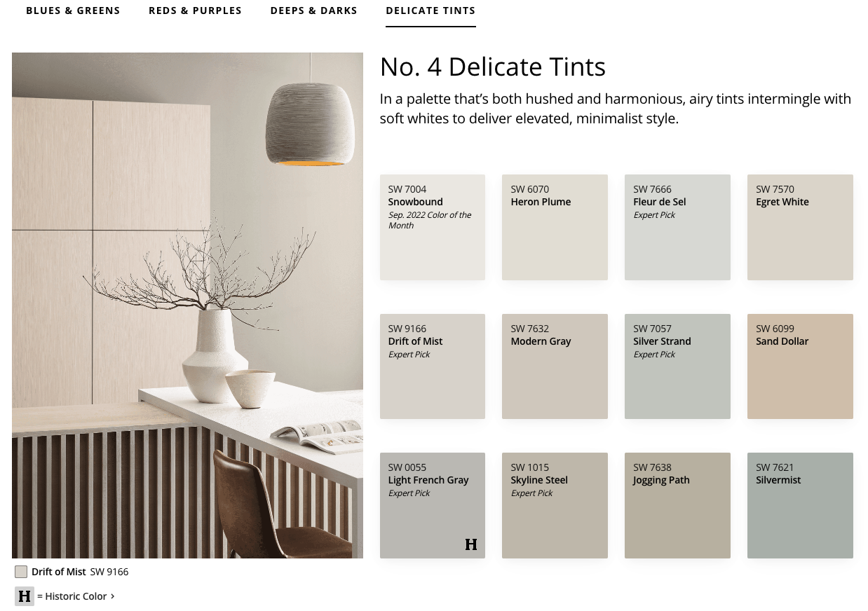
While Wadden believes gray was the defining shade of the 2010s, Sherwin-Williams’s selection of delicate tints shows how “our new neutrals” have moved in a whiter, crisper direction. Evoking notions of serenity and stillness, Drift of Mist, Snowbound, and others in this family show that you can tap into the trend toward brightness without going too bold.
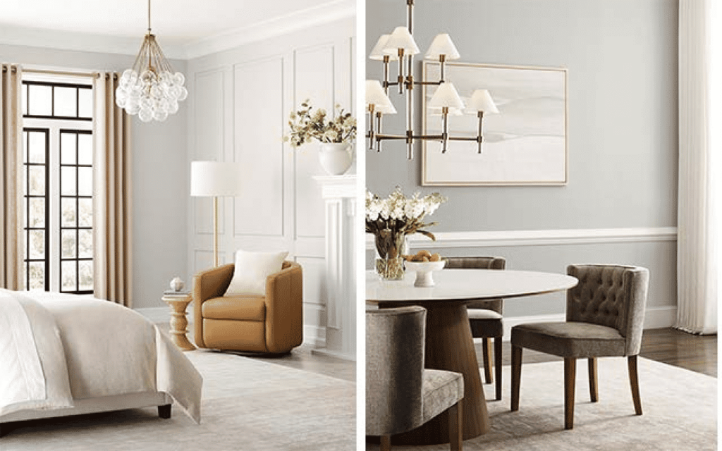
Left: Drift of Mist SW 9166 (238-C2), Flat (walls); Snowbound SW 7004 (256-C2), Satin (trim, fireplace)
Right: Silver Strand SW 7057 (237-C1), Flat (walls); Snowbound SW 7004 (256-C2), Satin (tr
Going forward, the plan isn’t to abandon the Colormix Forecast’s emphasis on 12-month trend cycles entirely. But for now, the Anthology approach will provide design pros and savvy consumers with a longer view of what’s happening in the color world, while trusting them to pick a trending color fit for whatever mood resonates.
“You can see the application based on pure color alone,” Wadden states. “It gives a little more flexibility to the world of interiors.”